
Who would’ve thought you could have a conference inside a movie theatre? I certainly didn’t but that’s exactly where the Brisbane Analogue/Digital 2014 Conference was held. Quite a good venue choice actually with nice comfy seats! I managed to attend the second day back in May with speakers from respected agencies and individual artists. It was my first time attending an A/D event so was interesting to see what had to offer.
CJ Hendry
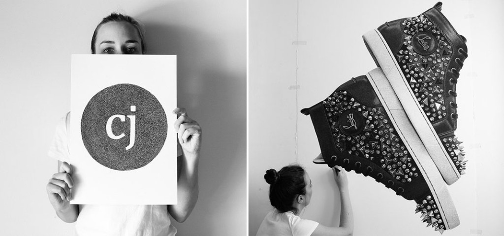
Our first speaker was CJ Hendry who didn’t originally start off as an artist, in fact she thought art was a joke. Her focus was originally on being a swimmer, before going on to study architecture and then changing to commerce. It was around this time that she realised that she had actually always loved drawing and she had always been really good at it. She took a year off study to focus solely on drawing, selling her entire wardrobe to Ebay to finance herself.
After entering a few competitions with no success, she decided to look at her art from a branding perspective. She stuck to drawing only in large format, drawing only objects and only using black and white. She is so dedicated to her black and white theme that she only ever wears black/white and her Instagram only features greyscale images. This positioning was intended to represent her artwork as luxurious and exclusive. Hendry shared that you should do what you love but also what you’re good at. It was also important for her that what she loved also made her money. This meant going all in with one thing and building a unique luxury brand for herself.
Looking to the future, she said while creating the art pieces is not all fun and games – working alone for 12 to 15 hours a day, 7 days a week – she is so hungry, passionate and foolish enough to think it will all work out. I think her artwork is quite amazing to look at, the detail of all the textures and shapes is beautiful and appears spot on. It would interesting to see them close up and admire how the work is actually all made with ‘scribbles‘.
Meggs
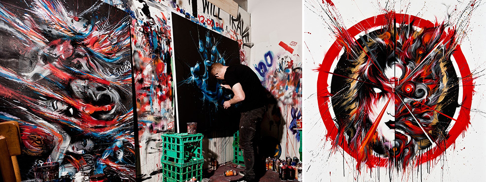
Meggs introduced himself as a street artist and a fine artist with a background in graphic design. He drew from an early age and knew he wanted a career that allowed him to visually communicate. He ended up studying graphic design and worked in the industry for several years. During this time, he always experimented with his work and enjoyed the process of creating. Along the way, street art caught his attention and because an outlet for them, enjoying the direct nature of it and meeting other creatives involved in the scene.
From this he became part of a community Everfresh that would get together and form ideas for street art pieces. With their own studio to work in, Meggs found it to be a good environment to learn new skills and experiment, helping him grow as an artist. The collaborative efforts of the team were rewarded when their work was included in an exhibition, making them part of the Australian art scene. Finer art became cathartic for Meggs for it allowed him to express his feelings and emotional state. Organically he moved from street art into fine art and has done several exhibitions all around the world. He likes expressive and abstraction in his work, often starting off with sketches and allowing them to take form before abstracting them. There is also his obsession with duality that is often present as well such as his work with dual masks.
His approach to public street art is often a cultivation of the culture around it, making the work more fulfilling for him to create. He also liked the interactivity in the art, whether it being part of a gallery show or something more local like reflecting on social issues. While being an artist is hard, Meggs noted that if you’re passionate and the journey/life experience is rewarding then it makes it worth it. I can tell that he has definitely been on a journey starting as a graphic designer before taking on a career in street art and now fine art. I also came to realise what a collaborative community street art really is, a theme which also popped up in the next speakers presentation.
Mr Penfold
Mr Penfold hails from the other side of the globe in Cambridge, UK and his attraction to graffiti art came from his interests in hip hop and skating scenes. It wasn’t until he traveled overseas that he saw some amazing street art that made him read up on the scene and start creating his own street pieces with his friends. In his work he started mixing styles that used spray paint but also had graphical elements. The problem with was that while it was taking up all his time to make these works, he was getting no money from them.
It was then that he got into computers to make digital screens. While he hated using technology, he learned new skills and started producing packs of stickers that he could sell to make money for travelling. His unique style became recognised and he has worked with galleries and clothes line that promote his work – noting the importance of making sure these brands meshed well with his distinct style. Graffiti art is still a big part of his work, highlighting many examples of his street art including his addiction of painting roller doors and the sides of trucks.
Most of the pictures shown were taken by fellow collaborators as he found he was often so wrapped up in the process of creating, he rarely documented his work himself. He never paints alone, preferring the social and collaborative side of graffiti art. By working together, it pushes you more than it would if you were by yourself, even declaring that and while you could make no money from it, being able to travel and do what you love while meeting and collaborating with others makes it worthwhile. Recently, he has been making fine art pieces that are more matured and abstract, breaking down his distinctive character elements and displaying them in a different fashion. This has also allowed him develop his own rules for how a piece should look while still expressing his art style.
SouthSouthWest
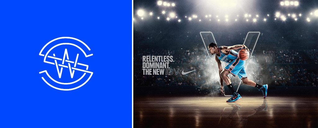
Our second half of the day featured design studios, starting with Andy Sargent from the Melbourne based SouthSouthWest. He shared several selected projects with us while highlighting their process and inspirations. The first project showcased was their branding work for Ta Shebube Lodge Botswana where they able to travel to Africa and have their eyes opened to a place that was not exposed to design. After camping for 3 days in the Kgalagadi, they came back and began to focus on trying to contextualize the experience of their journey, sketching and drawing out ideas, an essential part of their process in the studio. Their final branding for this smaller project captured the spirit of the place, in both the logo, type and treatment by bringing the cultural aspects of Africa back to the studio and not just applying their design skills to the job. Despite being only a small project it was probably my favourite.
Going from a small project to a much larger international brand, we were shown two examples of work SouthSouthWest had done for Nike around the 2013 and 2014 NBA All Star games. Their first was an event experience called Area 72 which allowed people to walk through space inspired domes filled with Nike paraphernalia and basketball players positioned as super beings from outer space. The second project was the branding and retail fitout for the 2014 All Star weekend where they pulled inspiration from the city of New Orleans, developing a quilting language and pattern for the campaign. For both projects, they were pushed to create something amazing and when designing imagined what the experience would be for a young basketball obsessed boy. My favourite element from these was the icons they made for the 2014 All Star that represented qualities of the star players while also drawing upon the mystique of the city. Sargent imparted that it was important for us designers to use our creative ability to have a positive power on the world.
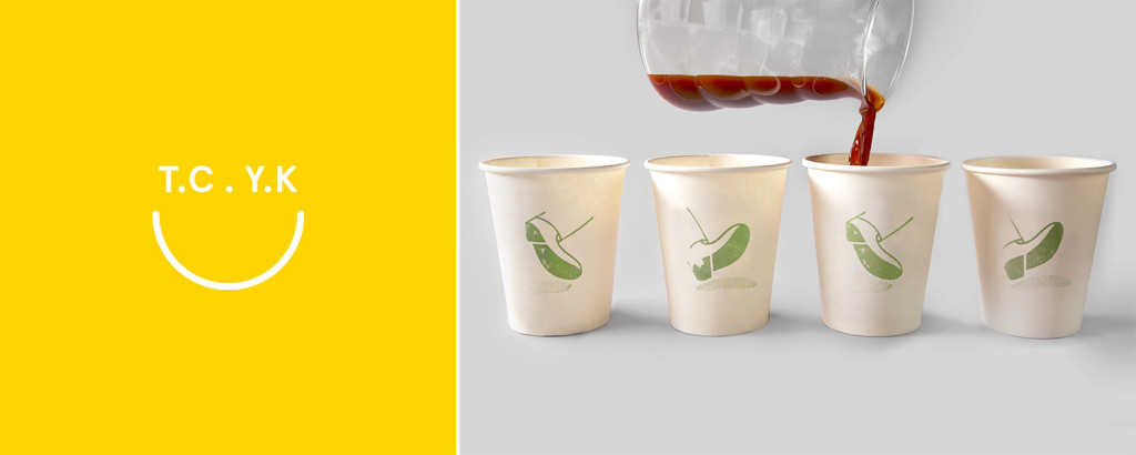
The Company You Keep (T.C.Y.K)
The Company You Keep (T.C.Y.K) is another Melbourne based studio, a small four man team to be exact. Rhys Gorgol, the creative director, started off explaining how as designers we shouldn’t “go chasing waterfalls” like trends because we shouldn’t sacrifice the subjects of the design to fit a particular style. Instead of retrofitting we should make the design right for the job. This all comes down to the importance of visual communication – the beauty of a project is a given, it’s our jobs to communicate the brand by trying to make the designs solve a need.
The design must have clarity to ensure audiences understand it and know the message and this can be done just by saying it simply and building details and message over time. Gorgol gave us an example of this with their project for Bundle, a hospital bag with all the items you’d need to have a baby, which they were able to build from the ground up. They even got to create the name which refers to both the product itself and to maternity references like ‘a bundle of joy’. Gorgol emphasized the importance of approaching production with reason and not applying all the special treatments if they’re not needed like using a simple emboss on the tag to slightly imply to the notion of bulging belly.
Branding and design should connect with its audience and we should help them participate in the brand, filling in the gaps themselves and building their own understanding of it. This could be seen in T.C.Y.K’s work for Traveller which featured feet walking across the cups if lined up next to each other, a small little novel element that someone might notice when they put the cups together at the office. It’s just a fun little piece of the branding that helps build a connection with its customers.
When referring to the work of the studio, Gorgol said “if it wasn’t fun, we didn’t do it”, highlighting the value of finding work that’s fun to create and that we should build brands that people respond to. These guys were probably my favourite speakers of the day and I like the way they approach projects and build a personality into design for their clients.
Supervixon
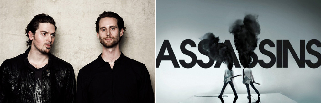
Our last speakers were Supervixen who I hadn’t seen since Semi-permanent in 2011. They recounted their back stories of working with each other at various studios, picking up a variety of skills along the way while working in small team before they decided to join forces and create their own studio. The work they create these days is mainly broken up into three categories – agency, film and games. They shared some of their projects such as the intro to the Frankenstein movie which they somehow manged to whip together in 14 days and their illustration skills for Elan skateboards.
Looking to the future of the studio, they noted how they were now creating a lot more work for film and games that allowed new creative projects and less TV commercials. They are also working on more international work with some web projects as well to help pay the bills. Sounds like they’re keeping themselves busy!
The guys left us with some final insights from their experience in the industry. They noted that designers should work smart, not hard and they should watch how agencies work in-house to learn how they could do it better. For people who were new to the industry, they told them not to be worried about being the “junior” of the team and that it was okay to ask lots of questions rather than sit there not knowing what to do, hoping for guidance. While there may be no money in some of the work you do, you will meet like minded people and through your work you have the power to influence a huge audience.
Field Trip
Supervixen didn’t get to leave the stage for long for they were called upon to participate in Field Trip, where creatives show their process from start to finish on a small project piece. Their task was to be try and emulate a promotional clip from Adobe (which I unfortunately can’t find). The team split up, one taking on the task of cutting out and masking photos of people’s faces, the other creating the visual effects that would be projected over the person’s face. The effects was then run through the mask and then projected back onto the person’s face and filmed.
You can see the process and final result in this video from the 3:50 mark (video by Camille Santiago)
All’s well that ends well
I’m really glad I got the chance to attend Analogue/Digital this year. I got a learn a lot about these fantastic artists and studios and I’m already looking forward to hearing about next year’s line up! Definitely a conference I want to attend again :).


