Most people I know (think that I’m crazzaeeeey!) use Google products or services at some capacity and since the launch of Google+, they’ve been slowly updating their UI and designs to give them a much needed face lift. Recently the new Gmail and Google Reader layouts were unveiled and it’s been interesting to see how the changes have affected my experience with them.
Overall Changes
Before I jump into specifics, I thought I’d quickly go over updates that have been implemented across most Google services in an effort to make them more seamless and coherent. One of the main differences is the top display bar which more clearly anchors the navigation, a lot better than the links just hovering around the top like before.
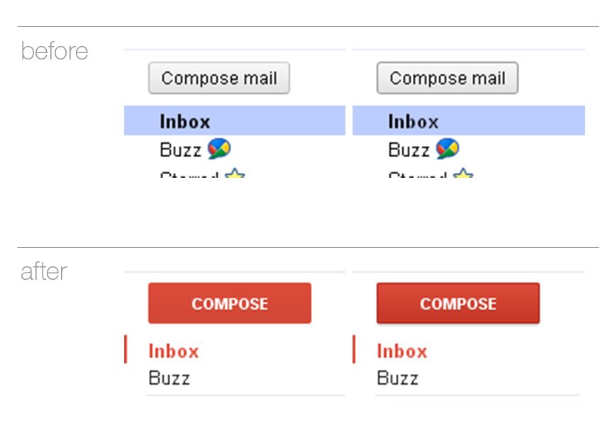
The blue and white colour schemes have now been replaced with more subtle greys and important function buttons (e.g ‘Compose’ in Gmail) are now consistently placed and more obvious in red. Most other elements have also been padded out to give them more room to breathe.
All the hover states for buttons are now subtle gradients with a slight drop shadow instead of a small grey outline. Despite being barely noticeable I think its a good upgrade from the previous design.
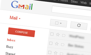
Gmail
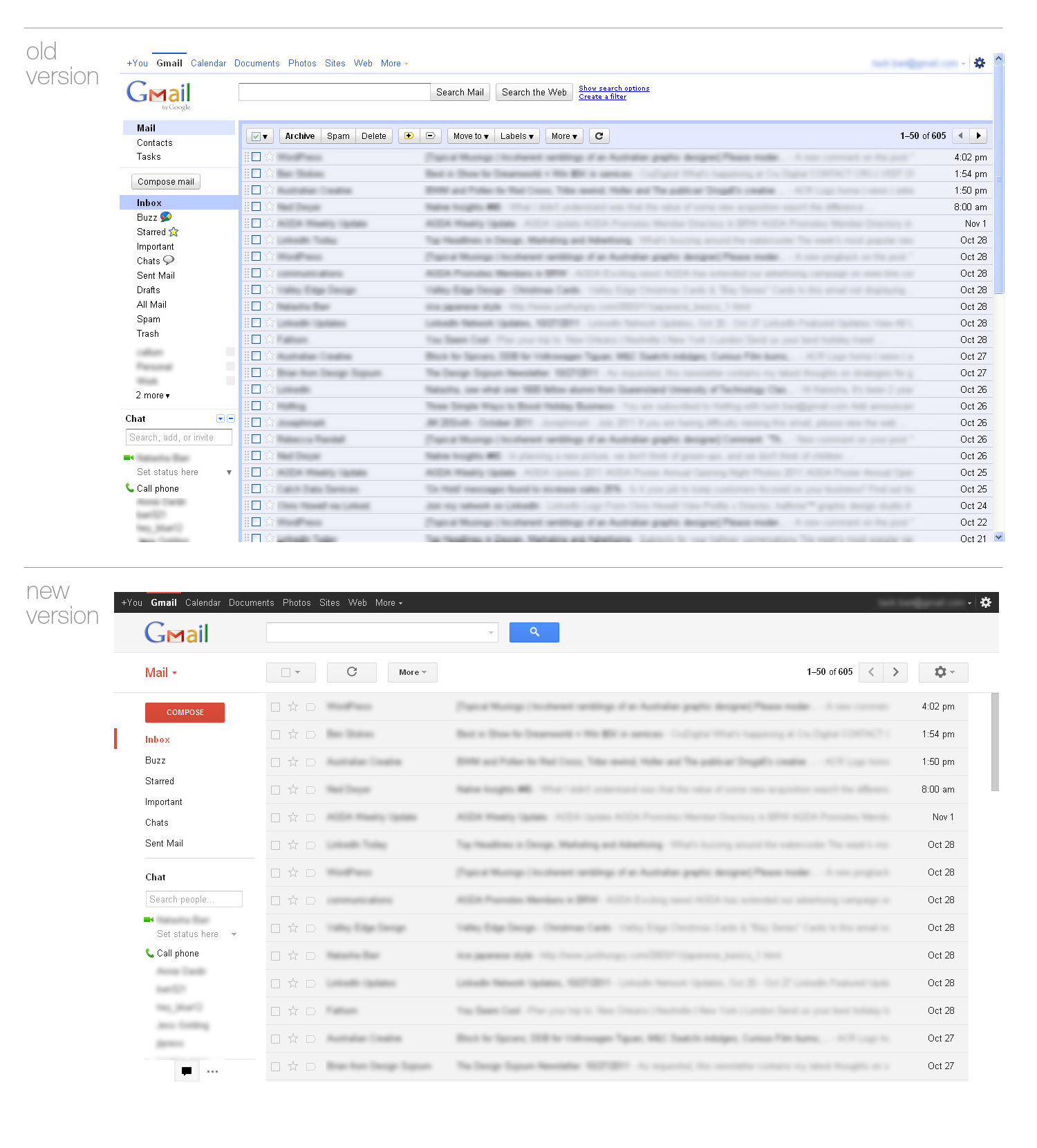
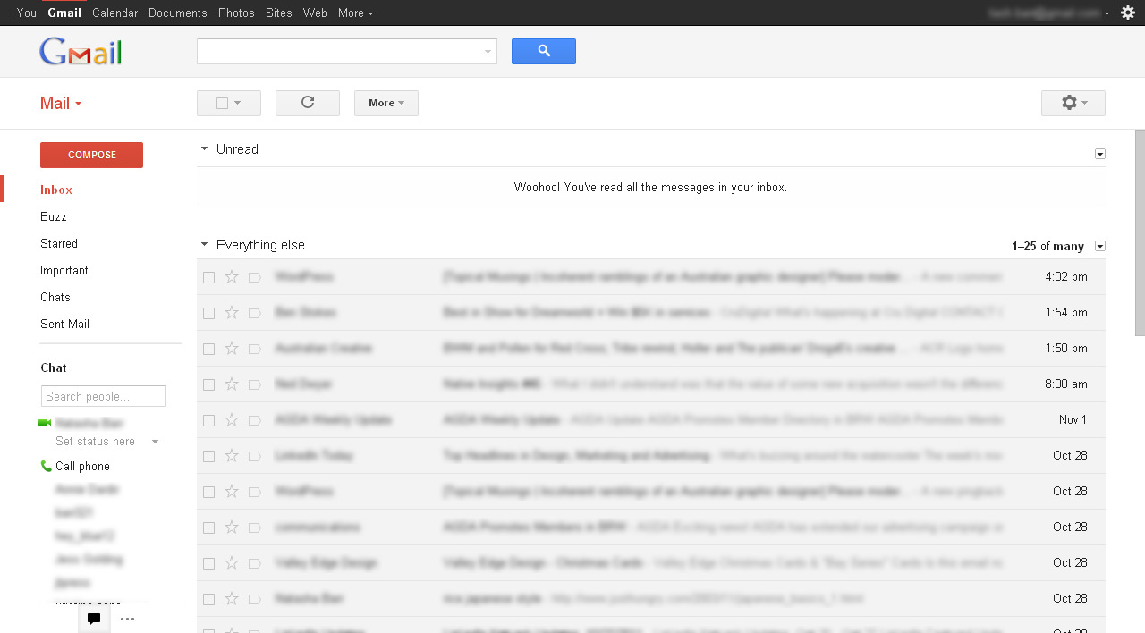
If you use Gmail, you’ll have noticed a little button at the bottom suggesting you to “Switch to the New Look”. I’ve changed over my business gmail accounts but I’ve been reluctant to on my personal emails. This has given me the chance to compare their functionality over the last couple of weeks.
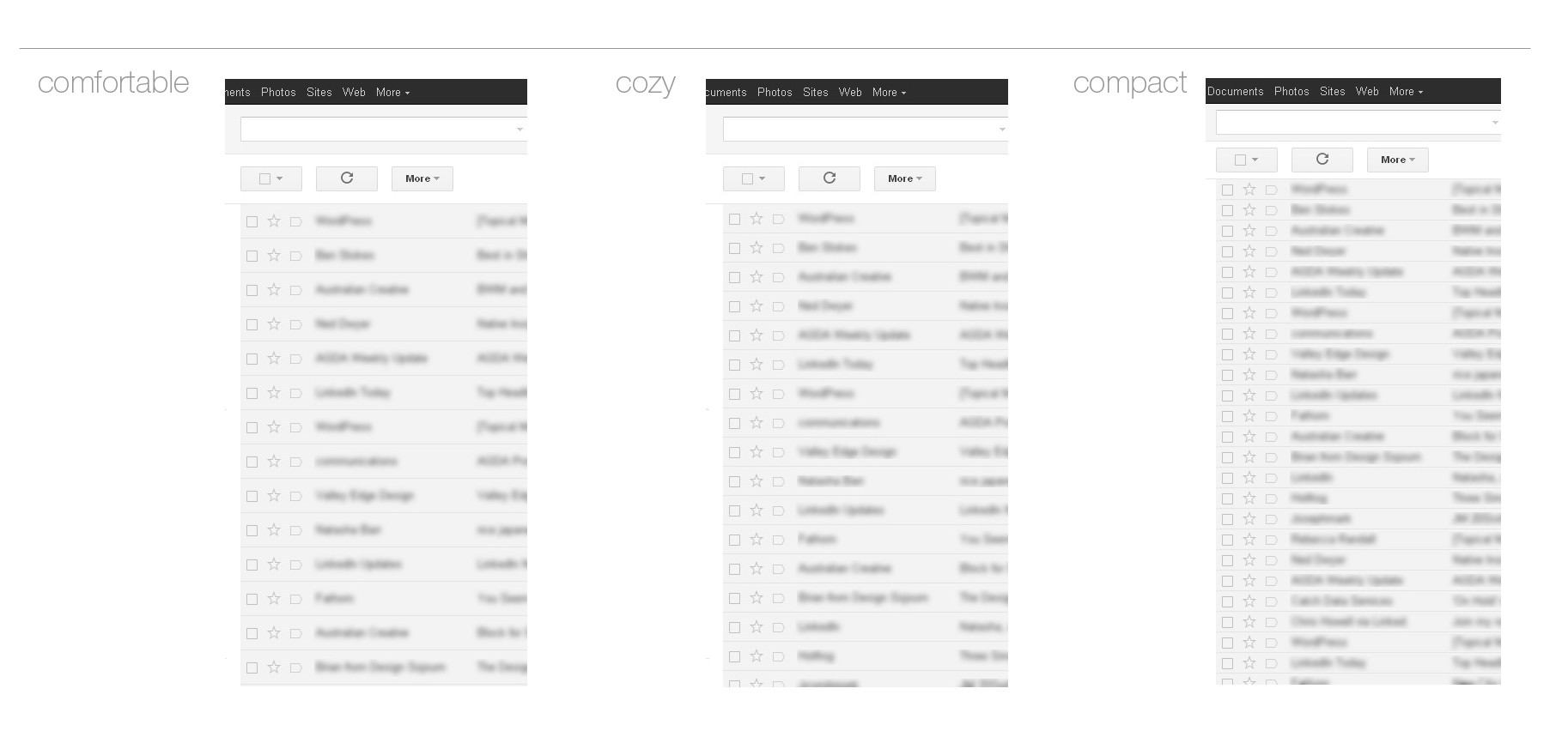
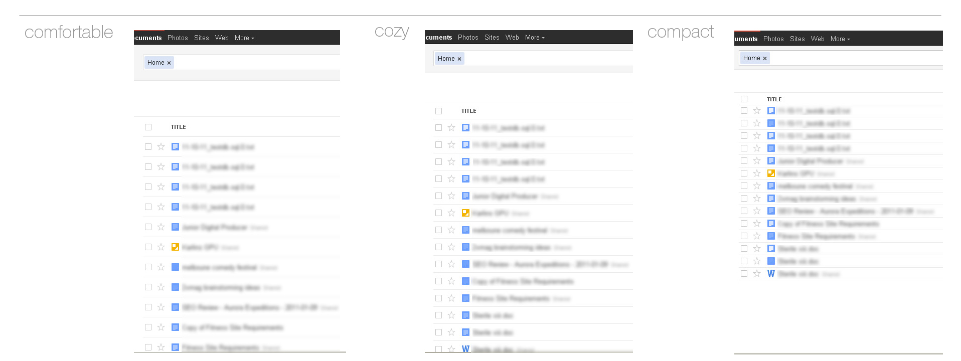
The most interesting change is the option of Display Density which would be better named ‘how much do you want to pad out your page’. When changing over to the new version, the density is defaulted to ‘Comfortable’ with options for ‘Cosy’ and ‘Compact’ on the settings. Ironically, I personally found the Comfortable setting actually makes checking emails more uncomfortable for me. Because of the padding between each individual email, lines takes up more space and therefore there are less emails on display. On my small screen size (1280 x 800) this means a lot of emails are hidden below the fold. I also find the Comfortable display harder to read and it now takes me longer to search through older emails due to having to scroll further.
This is even worse if you have your Inbox type set to something other than Classic because it pushes them down further.
I’ve keep mine set on the Compact which pretty much resembles the old Gmail display. I think Cozy would be fine to use if you use the Classic Inbox Type or if you a much larger screen. What do you think about the display densities?
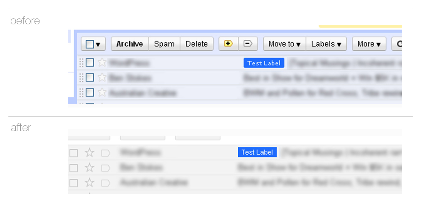
Other changes worth noting are in the details, such an update of the icons for stars and priority emails. The labels are now larger and in an easy to read font while they have removed the rounded corners to keep them simple.
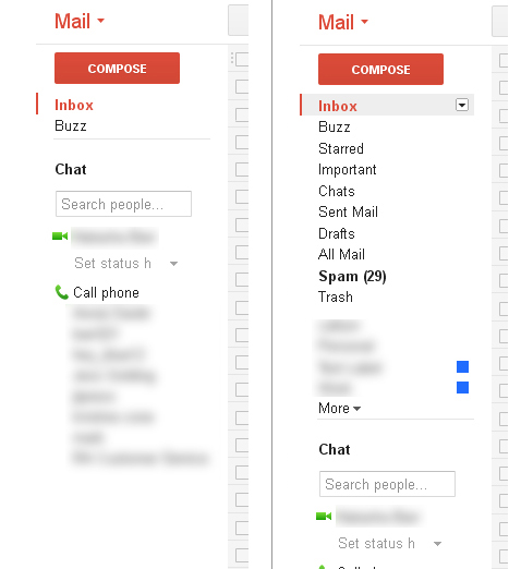
The side bar now moves up and down if you’ve dragged your chat box over the other Inbox folders, sliding down to reveal them when you hover in the area. It’s a nifty idea how I’ve found it can be a little distracting if done accidentally in a “What just moved?! Oh, the sidebar” kind of way. However, you can hide the chat area completely by clicking at the speech bubble icon at the bottom of the sidebar if it becomes too bothersome. Do you guys find it annoying?
I do like the extra options that only appear when you select something, making less confusion if you’re prone to pressing delete with nothing selected (like me ^^;).
Google Calendar
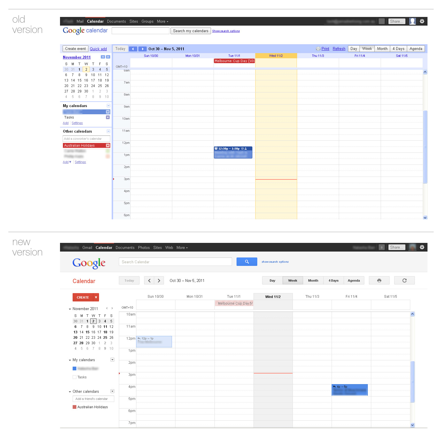
We do lot of scheduling meetings and noting vacation days in our Google calendars at work. I’ve always liked the the colour coding of peoples individual calendars and being able to clearly see everything that’s going on in the week.
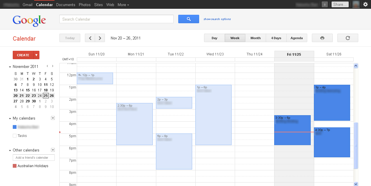
It’s been interesting to see how this has changed. One thing I’ve noticed is the fading out of previous day’s events. Originally I thought all of the events were faded and I was kinda annoyed by this before realising what was going on. Only present and future events are in full colour while the others are faded. Pretty clever. I have noticed that other’s calendars appear with diagonal stripes but I’m not sure why, it seems a little unnecessary. Thoughts?
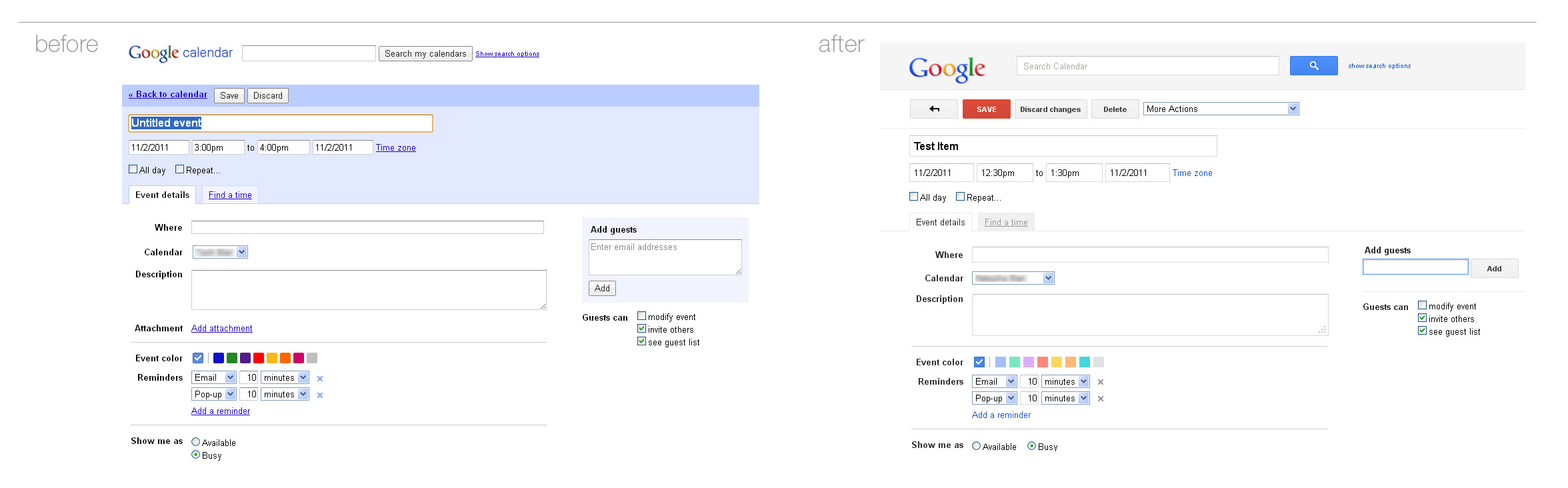
The Create Event page is pretty much the same as before with a few elements moved around and updated.
Google Docs
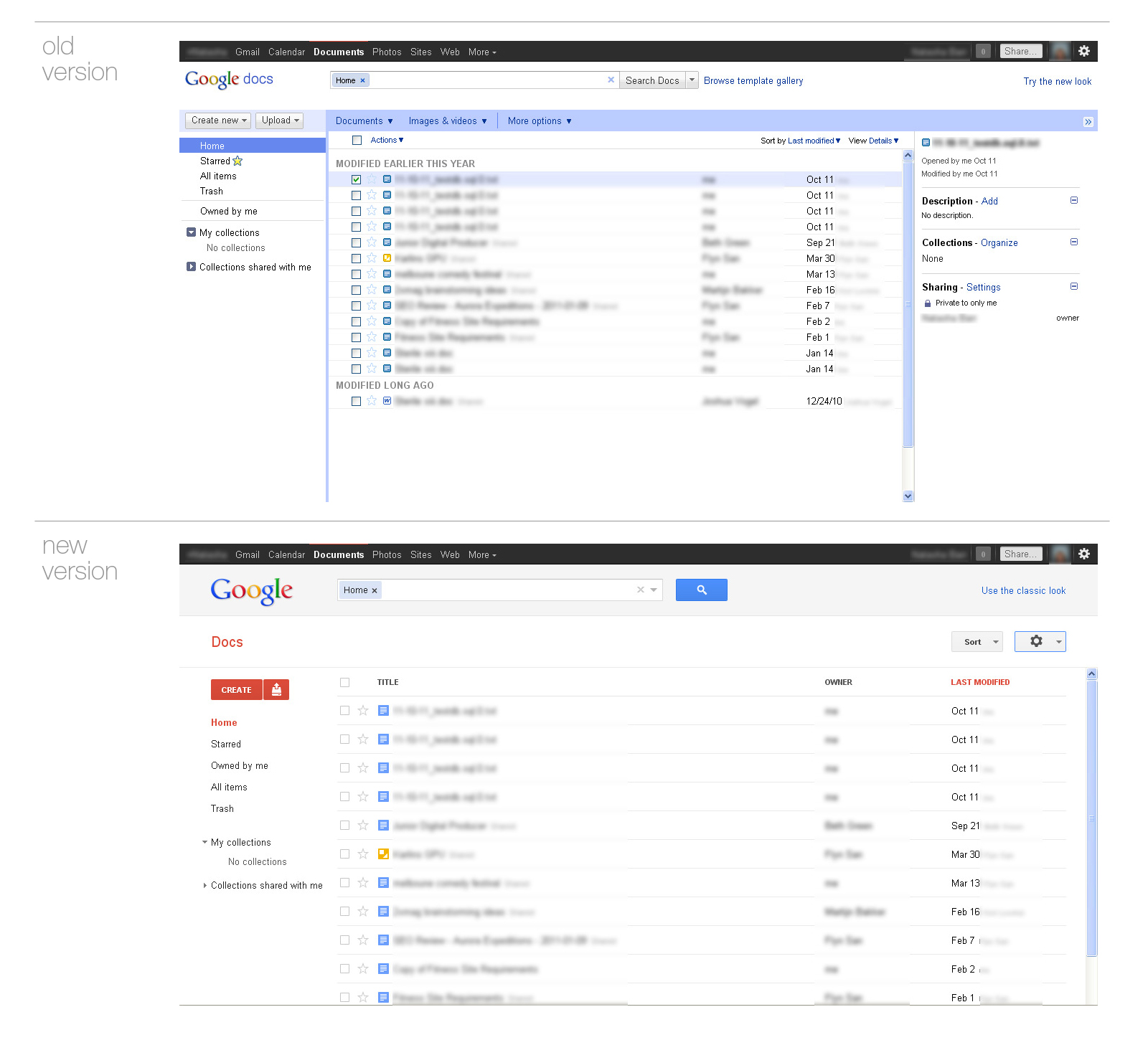
I rarely use Google docs but I know others do so I thought I’d compare it’s update even if only based on aesthetics. Noticeably, the right hand summery that appeared in the old design has now been removed and the focus is on the articles making it appear a lot cleaner.
Similarly to Gmail, there’s are the Display Density options and I have the same opinion on this as before. Comfortable just seems to waste too much space.
I don’t have a screenshot of what document view looked like before to compare but I like the simplicity of new design. I’m not sure how this affects editing and working with the document though. Let me know in the comments!.
Google Reader
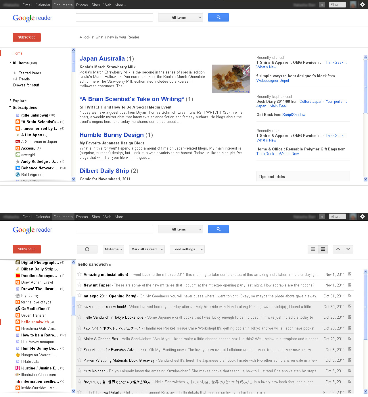
Google Reader is the product I probably have the most gripes about. I’m surprised that the some of the functions available in other services are not in Reader. When I first started writing this I was annoyed by lack of some features but it seems these have been recently corrected! While I still can’t change back to the old version like Gmail and Docs (which was going to be inevitable), the Display Density options that were missing before have now been implemented so I no longer am frustrated about using Reader anymore ^^;;.
One thing that still bugs me, and this is purely aesthetic, is that in expanded view the selected article only has a border on 3 sides! I don’t even understand the logic of this unless it’s a browser/screen size issue in which case I might forgive it but I have my doubts this is the issue.
Conclusion
While Google now looks up-to-date with the rest of the web, I find myself a little confused with some of the new functional changes and options. Or maybe I just don’t like change. I have to admit that it’s good to see a more uniform theme across the Google product range (except Analytics, what’s with that orange?) and I welcome the updates.
These are only my thoughts though and only a small part of Google’s full list of products and services. What are your thoughts on the changes? Let me know!