
I think most of the Australian design community is aware of Telstra’s recent brand refresh by Interbrand which started circulating about a month ago. Since Telstra is arguably one of Australia’s biggest brands, it’s not surprisingly that this 3 million dollar refresh has been everywhere lately. I’ve decided to review the components of the campaign to see how it is now being rolled out one month on. Lets get into it!
Brand Identity
Before we get onto the rollout, lets have a look at this updated brand identity. I’ve got to admit that I really like it since I never was a fan of the the orange/blue colour combination. I think Telstra has been stuck with that ‘old business man’ persona while this fresh and modern look seems to be targeting the younger demographic.
I was a bit wary of the multiple logos colours at first, thinking that having so many would cause a bit of confusion for people. However reflecting on this, Telstra has pretty good brand awareness and the logo ‘shapes’ haven’t been modified so I guess they have a bit of freedom to play with this element. I still think there should be one ‘primary logo’ though. I’ve noticed that the blue version has sort of taken this role, which makes sense because it matches the blue used in the previous Telstra logo and advertising.
I’m wondering whether the others colours will come to signify more in the long term. For example, the cool colours could be used across pre-paid and personal services while the warmer colours for business and government items. I haven’t seen any correlation yet so it seems it’s just flair for the time being.
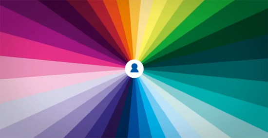
Lastly, the ‘colour burst’. I think it fits the branding well and has been used really nicely across all mediums, especially in the TV advertisement (below). I’m curious to see how they’re going to implement it in future advertising, they could do some really cool stuff with it.
TV Commercial
I have a bit of mixed feelings about this. Straight off, I think its visually lovely and that song makes me want to run through the mountains Sound of Music style singing “get out your rainbow colours!” at the top of my voice. The copy-writing for this ad is the part that has always thrown me. It reads –
“Today is amazing
Connect with almost anything and anyone from almost anywhere
Got Something to say?
Boom
The world can love it, hate it, ignore it, whatever
Stop and smell the roses you purchased online from the shop you just liked
Because it’s never been like this before
It’s life in full colour and it’s amazing
(Telstra) It’s how we connect”
Is it just me, or does this copy sound like it was written by Mark Zuckerberg? It feels like a promotion for the new features Facebook is implementing to basically use it as their ‘hub’ for all things online. Connecting with anything and anyone, buying roses from a shop you just ‘liked’?. Maybe Telstra is trying to connect with their younger audience by talking about the use of social media on phones, but I don’t know if this is clear.
One thing that’s always bothered me is the “love it, hate it, ignore it” line. I don’t think if it’s a good thing to have ‘hate’ and ‘ignore’ associated with your brand. The ‘whatever’ on the end also sounds very defensive. It’s like they’re saying ‘You’re gonna ignore us? Fine! Be that way!’.
Finally the ‘Life in Full Colour’ line which is the main theme/tagline of this campaign seemed a bit off to me at first. It just sounds very old, we’re not introducing the first phones with colour screens here! I wondered whether the audience would get it or would be confused. The more I’ve watched of the advertising though, the more it’s grown on me and made sense so I’m letting it slide.
Public Advertising
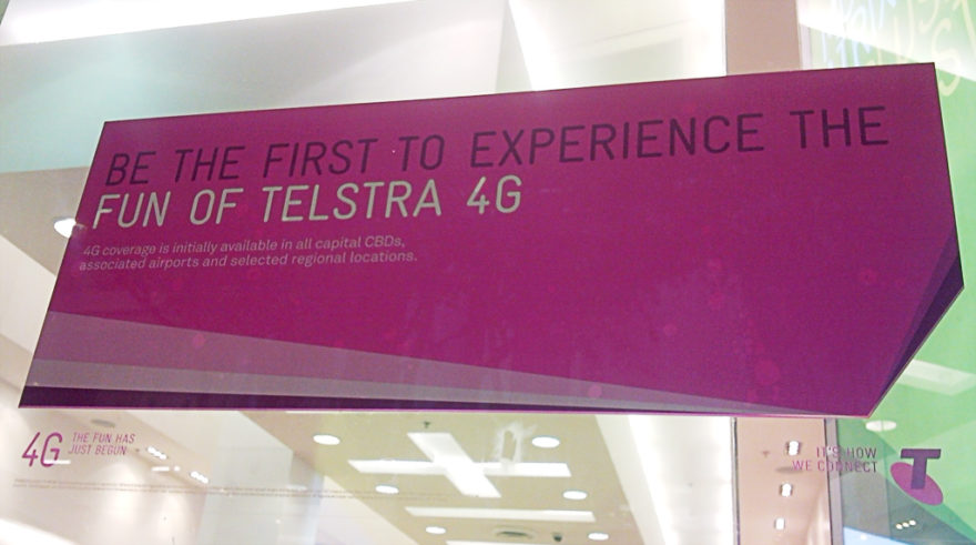
The main print/outdoor advertising I’ve seen for this campaign is in newspapers (Mx, Sunday Mail) and in bus shelters and train stations. The main promotions in these ads seem to be the new 4G network and their current pre-paid offers. Makes sense that they would target pre-paid for their demographic but don’t a lot of people go on plans now?
Website
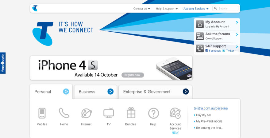
The Telstra website has also had a facelift, or at least it initially seems. The homepage is really simple and clean, the 3 main sectors and services are laid out the front in 3 easy to see tabs and other essential links to My Account and 24/7 support are easy to get to.

Inside in the personal section, it looks like everything has had an update with the new logos and fonts. The colour burst has been used in small bits here and there on some pages while on others it takes up a lot of screen space. The Meet the Team even as a bit of an interactive element. It did come to my surprise though when clicking through to find the My Account page had not been touched.
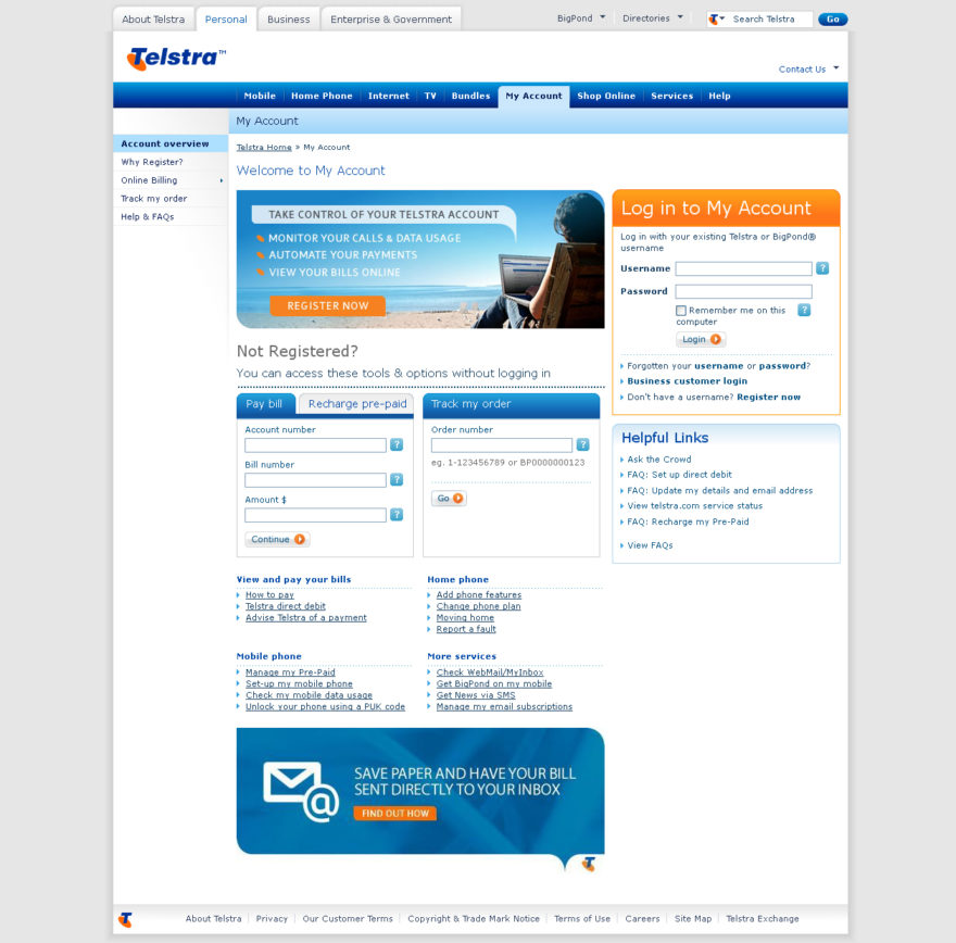
Turns out this isn’t the only one with the business and governments sections also being left out of the site update (picture below). I understand that they’re not focusing on these to markets right now and it has been stated that to save costs the refresh is being rolled out gradually. A part of me still thinks that they should’ve at least updated the my account page if not the whole site. Maybe even just the logos and colour schemes and save changing layouts and such for later. Just so it doesn’t feel so jarring going between the old and new.

Out of interest, I also checked the website on my phone (Android). The homepage tabs didn’t work so I had the 3 levels of services (where mobile, home, etc are) listed one under another and no headings to tell which was which. There doesn’t seem to be a mobile version for the other pages either and funnily enough, when I went to the ‘my account’ page I got a warning that the certificate for the site wasn’t secure O_o.
Social Media
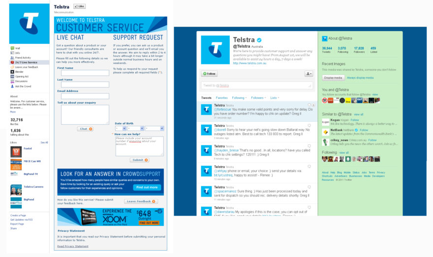
Pretty simple skin updates for facebook and both twitter accounts (@Telstra and @Telstra_news). Since social media is “where it’s at” these days, I’m wondering if they’ve changed how they use these platforms to engage their users. I don’t know what these pages looked like previously so I’m unsure if the facebook and @Telstra accounts have always been used for support. I think it’s a good thing though for reaching the market within the sites they occupy. Easier to use and you don’t have to sit there waiting on a call to reach someone.
Other Materials
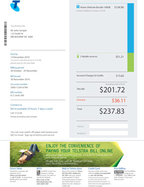
I also wanted to mention the updates on some of the other aspects of Telstra that customers often see – bills! I came across this via their Twitter account, showing an updated and more easily readable statement. It’s nice to know that these small things weren’t forgotten about in the refresh.
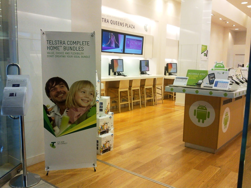
Finally the stores themselves. It seems all the printed materials have been updated while the signage is still the old branding. This is understandable though due to the costs involved in getting so many different sized signs updated.
Overall
Apart from a few small things (which I think may be more personal things than universal issues), I think the campaign has been rolling out nicely. But as @camillenathania puts it “they’ll need to do a lot of work from a customer service view to change their bad image in the eyes of consumers” which I completely agree with. A brand refresh alone can only do so much these days.
I’m interested to see how they’ll keep working with this in the future and what will be the next evolution of this new direction. I’m also curious to hear your thoughts on it too, especially those using Telstra services.
Do you love it? Hate it? Or are you ignoring it? 😛
I really like the new logos! I suspect Telstra is attempted to raise its sales numbers and brand perception from younger audiences who have for the most part been turned off from them due to Telstras high prices and horrible treatment of customers while Sol Trujillo was at the helm.
Their webpage seems significantly cleaner and faster than when I was a customer (5+ years ago) so that’s a big plus to them too. The cleaner designs definitely help with this but (bringing this comment back to the focus of your article) also make the site far less daunting to use than it previously was.
I agree that the ad wasn’t the best but all in all this was a definite improvement to the look and feel of their brand.
THIS IS AN AD CAMPAIGN, NOT A REBRAND
It is a campaign idea executed through design. The fact that the media keeps calling it a rebrand is seriously worrying. If the industry does not understand branding, we are in trouble. Branding i smooch more than the logo, but by keeping the old logo tells me that they have not changed at all. They have just put a colourful bandaid over the top – i am sure I am not the only one thinking this.
Firstly, I’d just like to thank you for your comment! It’s this kind of critical thinking I encourage and welcome on my blog
I don’t agree that this is an ad campaign. An ad campaign tends to be shorter in lifespan whereas this appears to be a more permanent change on Telstra’s part. The fact that they didn’t change their logo doesn’t necessarily mean they haven’t rebranded – or at the very least adjusted their brand. The fact that they released this video explaining how they’re going in a new direction and ‘changing the way [they] look and sound’ seems to back this up. I don’t believe an ad campaign would include an explanation video as the purpose of an ad campaign is to provide a clear and consise as possible message to the public – in which case an explanation video would not only be unnecessary, but actively discouraged.
Many of the smaller elements of the brand have also changed that indicate a rebranding. These include bill statements, SIM cards and packaging. A rebrand aims to reposition a brand which I believe they have done here to attract a new audience.
Finally, if this wasn’t a rebrand and so many outlets of the design community said it was, I believe Interbrand would have come out and said something. They have a blog post about their work for Telstra in which they say “We’ve helped Telstra evolve its brand identity as part of the biggest change to the company since its transition from Telecom in 1993” and then further down in the article link to 3 articles that mention ‘new brand positioning’, ‘brand refresh’ and ‘brand evolution’.
I don’t believe that so many people and respected design sources would have called this a rebrand if it wasn’t the case.
I feel comfortable calling this a rebrand for the simple reason that they are splitting up their divisions and being loud about it. If you asked people on the street what Telstra does, they will say three things: gives me phone service, gives me internet service, gives me a fuck up the arse. The rebrand isn’t gong to help with this last point. But the point of this rebrand is to say “You know what? No! The T-Box is not just some sad fad that fizzled out. It’s here to stay, damnit!” The whole point of the rebrand is to say “We can give you other shit, and still give you phone service and internet service with the same disregard for people that we’ve always had! How’s that for consistency?!” 😛
And I wish I’d taken a photo of the posters they’d had at Roma st station, when they had all the posters up on the platforms. Their ad for television on demand was “Get new Dexter now. Chop chop.” on whatever colour they’re using for their TV services. I thought it was kind of funny, but a little try hard.
Dear Tash,
It IS a rebrand. Thx.
First I’d like to make a comment at “Designer” (October 22, 2011)… “THIS IS AN AD CAMPAIGN, NOT A REBRAND. It is a campaign idea executed through design. The fact that the media keeps calling it a rebrand is seriously worrying.”
Derp Derp Derp. This is in fact a total rebranding of all Telstras style guides, not just a once-off campaign. brand.telstra.com if you don’t believe me, but hey, what would I know, I’m just the guy animating the digital POS.
——————————
To answer your question, “For example, the cool colours could be used across pre-paid and personal services while the warmer colours for business and government items. I haven’t seen any correlation yet so it seems it’s just flair for the time being.”, Telstra has advised us that there is no real correlation between the colours and the division that it’s relating to. In their words, it’s all about the “feeling”… So we choose colours depending on how many cups of coffee or cigarettes I have or haven’t had that morning.
——————————
The new branding is pretty cool in my opinion! Animating the colour wheels as they spin sucks the fat one though, and their departments (especially the Dealer arm) have little to no idea what’s going on with it. But it’s a good direction for them, it brings them out of the 1990’s/2000’s and into the 10’s well I think.